Buienradar – Case Study
Overview
Buienradar is an application where as described by its name in Dutch (showers radar) you can accurately track showers or rain. Most of us have probably used a weather application to check the weather before planning our week or weekend.
Buienradar allows you to track showers more accurately than normal weather apps, because of its detailed information about them the app does not limit itself on showers and rain but also offers complete information about allergens, UV index, Pressure etc.
Challenge
Users of this app have told me a few times, due to the technical aspects of buien radar they feel overwhelmed and sometimes they misread the raincast, sometimes having a feeling of frustration.
Goals
My main goal in this Research is to understand the pain points that are causing the design of Buienradar and find insights to solve the User Experience.
Client: Concept
Project Name: Buienradar
Website: buienradar.nl
Project Categories: UX, UI
Developed in: Figma
Original Design
Competitive Analysis
After researching through the competitors I found some of them have already implemented a more minimal approach in their design system.
Opportunities
- Buien radar offers more information than any other app.
- Buien radar is one of the most used showers app.
- If buien radar evolves fast it can easily be positioned ahead of his competitors.
Challenges
- Buien radar has to catch all the other apps in their visual design.
- Reducing accurately the frustration it produces in some of its users.
- Designing a more efficient data architecture.
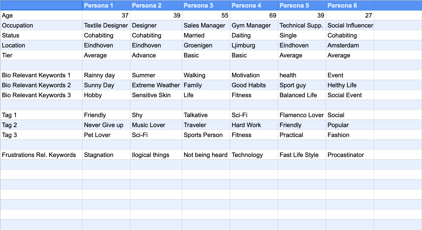
Interviews and Surveys
I based my research on the people that I already know that are using this app, in the following spreadsheet I gather the data recollected.
Findings
The results of the research are the followings
- 66% Mention fitness is important for them
- 16.6% Mention they may need to track the UV Index
- 33.3% Label themselves as Basic Technology Users
- 50% Label themselves as Average Technology Users
- 16.6%Label themselves as Advanced.Technology Users
- 5 out of 6 persons mention they are interested in tracking their health
- 2 out of 6 persons mention they use the app to track rain and choose the best time to take a walk
- 2 out of 6 persons are active and sporty
- 1 out of 6 person mention the need to track UV Index also
Casual Finding
I had the opportunity to see people interact with Buien Radar, and it gave me a casual insight about the user experience, people find themselves more comfortable with the timeline view. This already gave me an idea I will share in the brainstorm section.
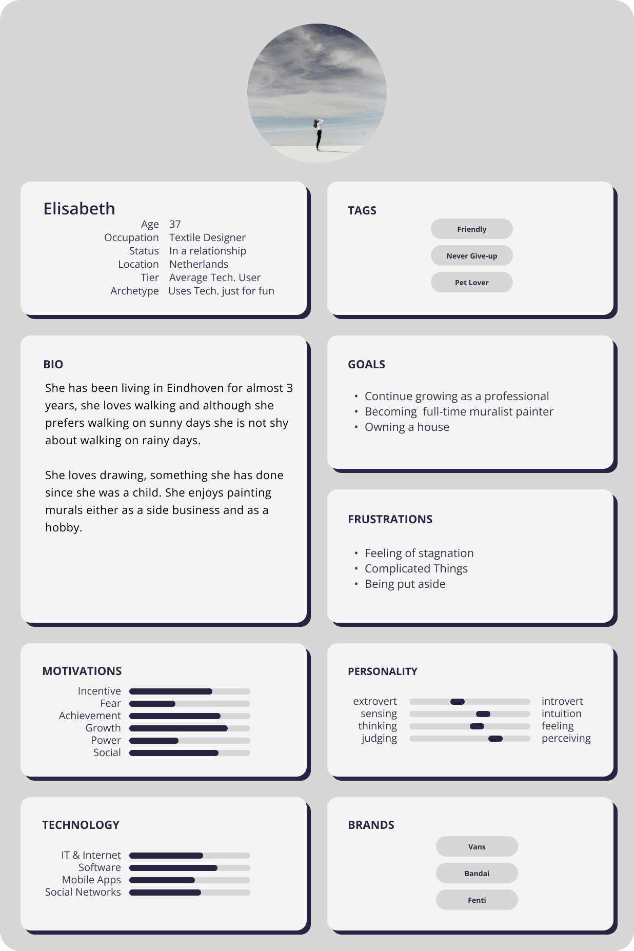
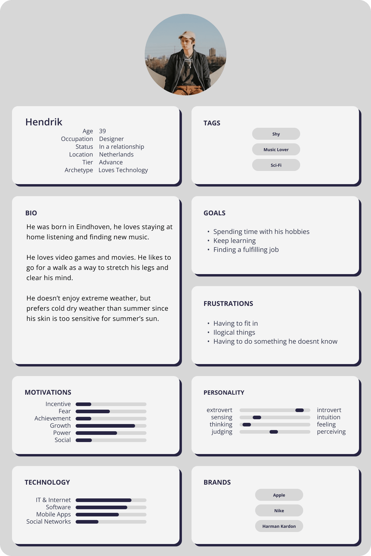
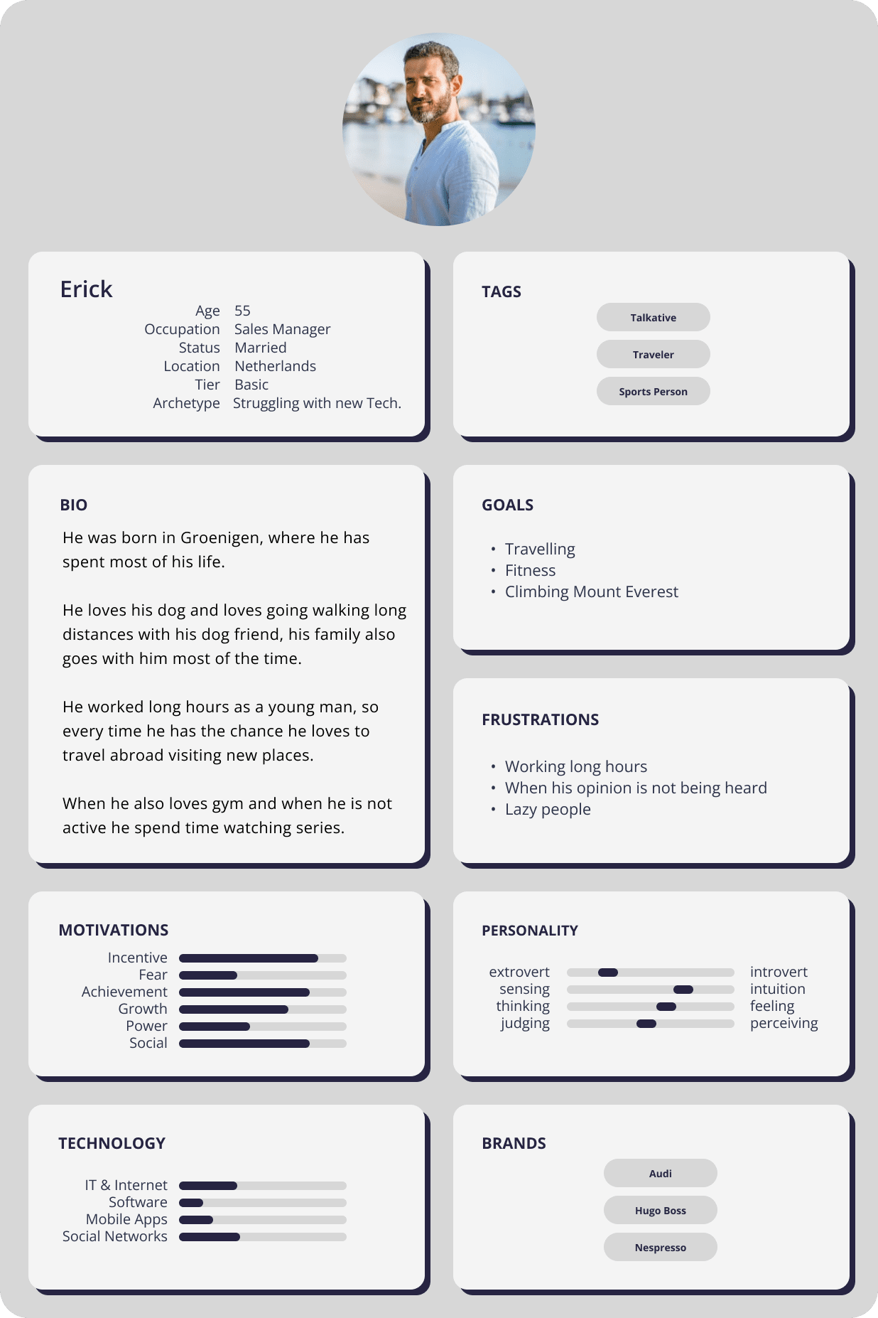
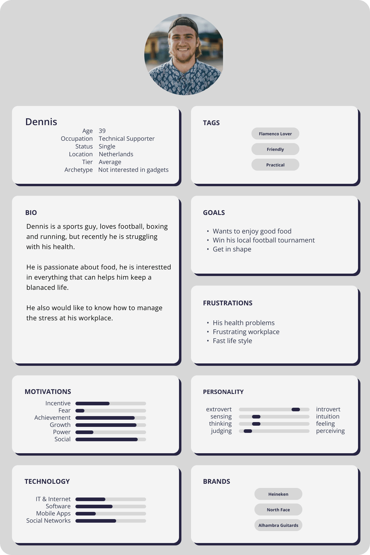
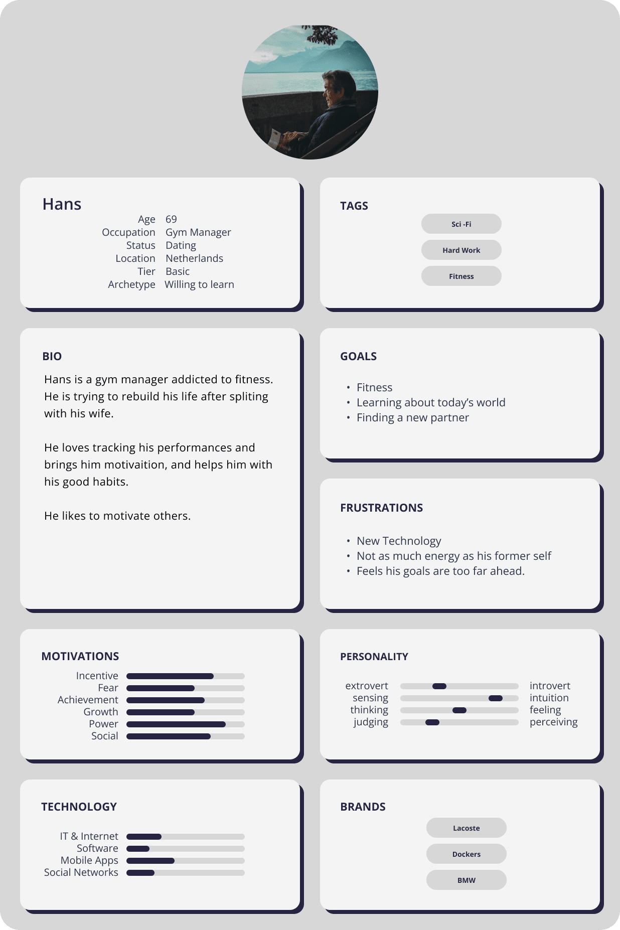
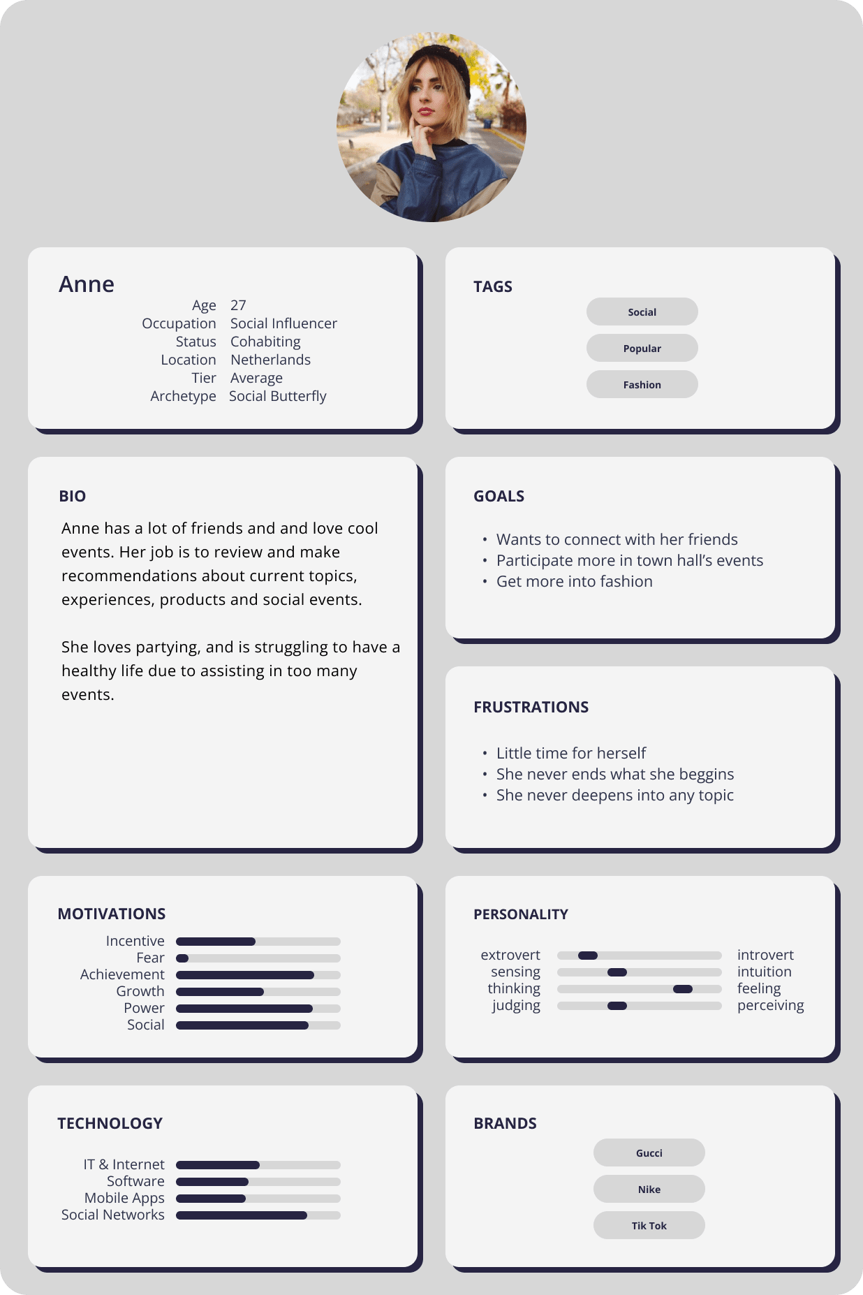
Empathy Map Building Empathy
Based in the people I interviewed I created the following personas
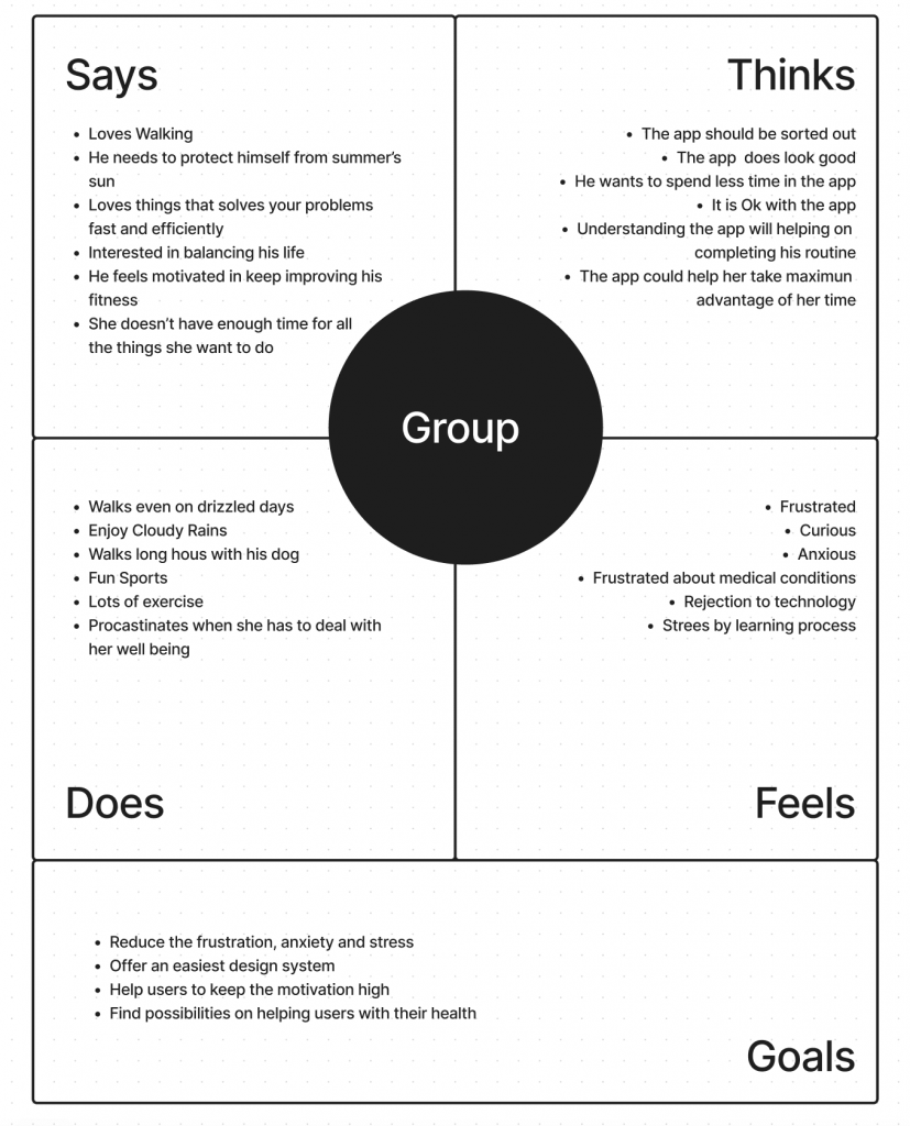
Goals
- Reduce the frustration, anxiety and stress
- Offer an easiest design system
- Help users to keep the motivation high
- Find possibilities on helping users with their health
Brainstorming
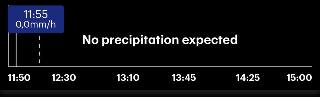
Through the researching process I found out that there are 2 elements that you can find in all shower’s radar app
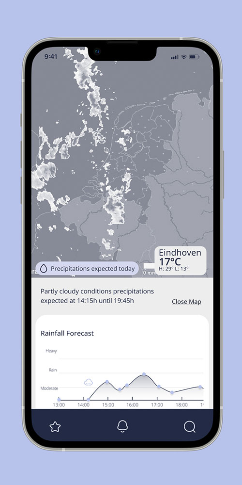
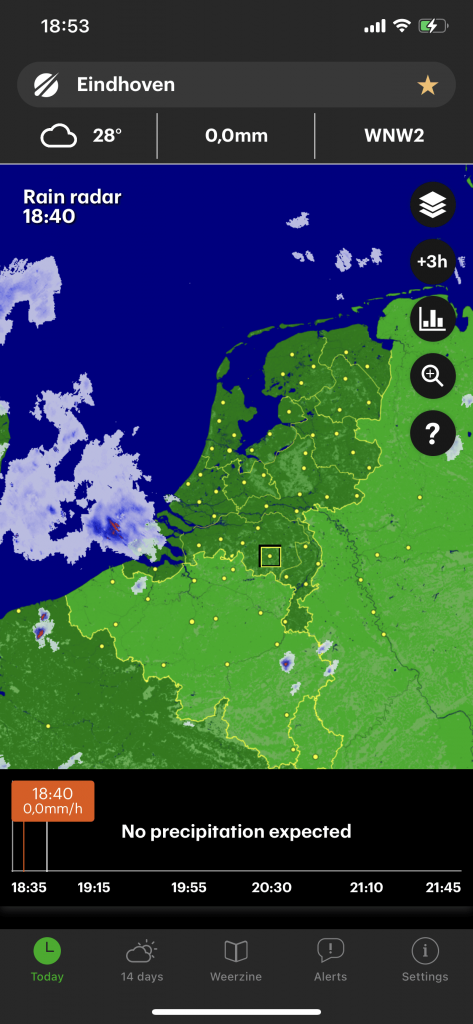
The animated map that shows us how the clouds move towards your location
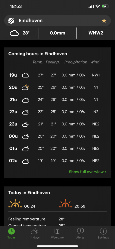
The timeline offers us the precipitation expected and the time of the precipitation.
From these elements the map seems to be the one creating more confusion since you can’t read the map without the timeline, because the clouds don’t necessarily give you information if this cloud will bring drizzle, heavy rains or none; more over this map usually covers more than 70% of the screen and is filled with layers of information example, UV index, Mosquitos, Pollen etc.
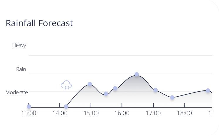
The Solution
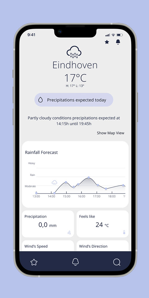
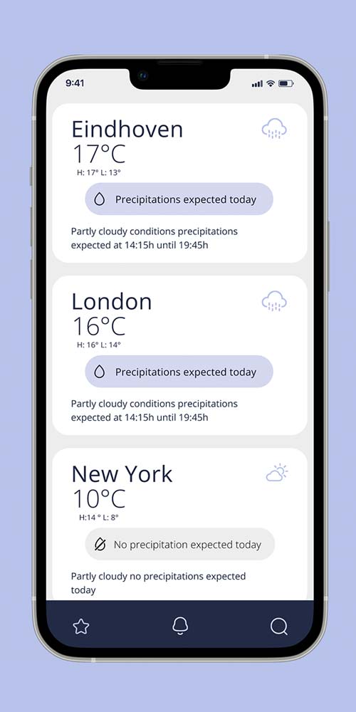
The timeline as the main component.
The timeline gives us all the information the map gives us and more, in the interviews people seem to prefer the timeline since you can easily see the forecast for up to +4 hours from the local time we can boost the timeline information to give even a more detailed information and maintaining the map option available for those who need or want to watch the map.
Data Architecture
After Identifying the main issue with our app and finding a the new main component, its time to focus on in points we need to solve thought the data architecture.
- Improving the user experience analysing the data structure.
- Simplifying the experience for most of the users.
- Finding a way to keep the more technical data that more experienced users and specialists may need.
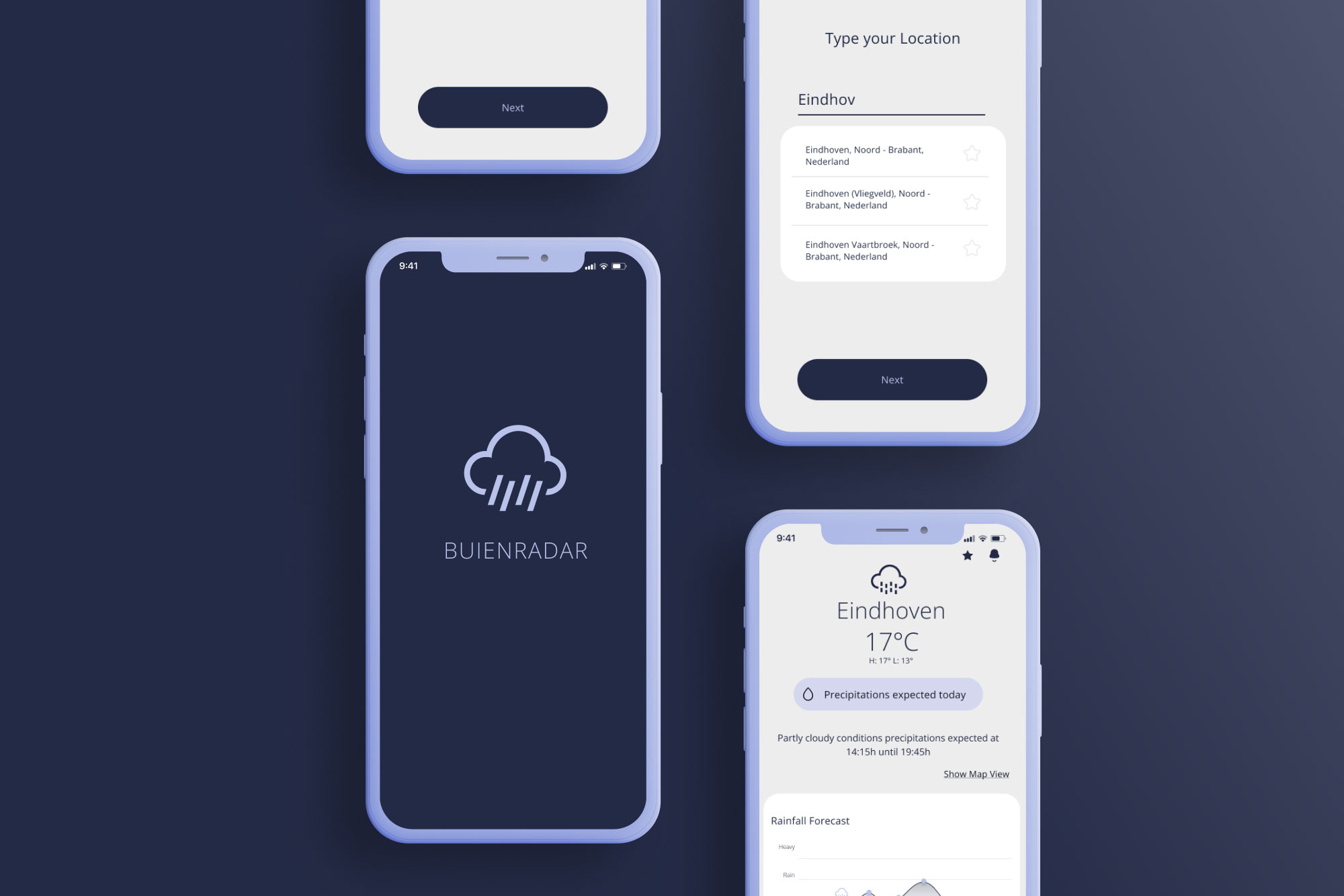
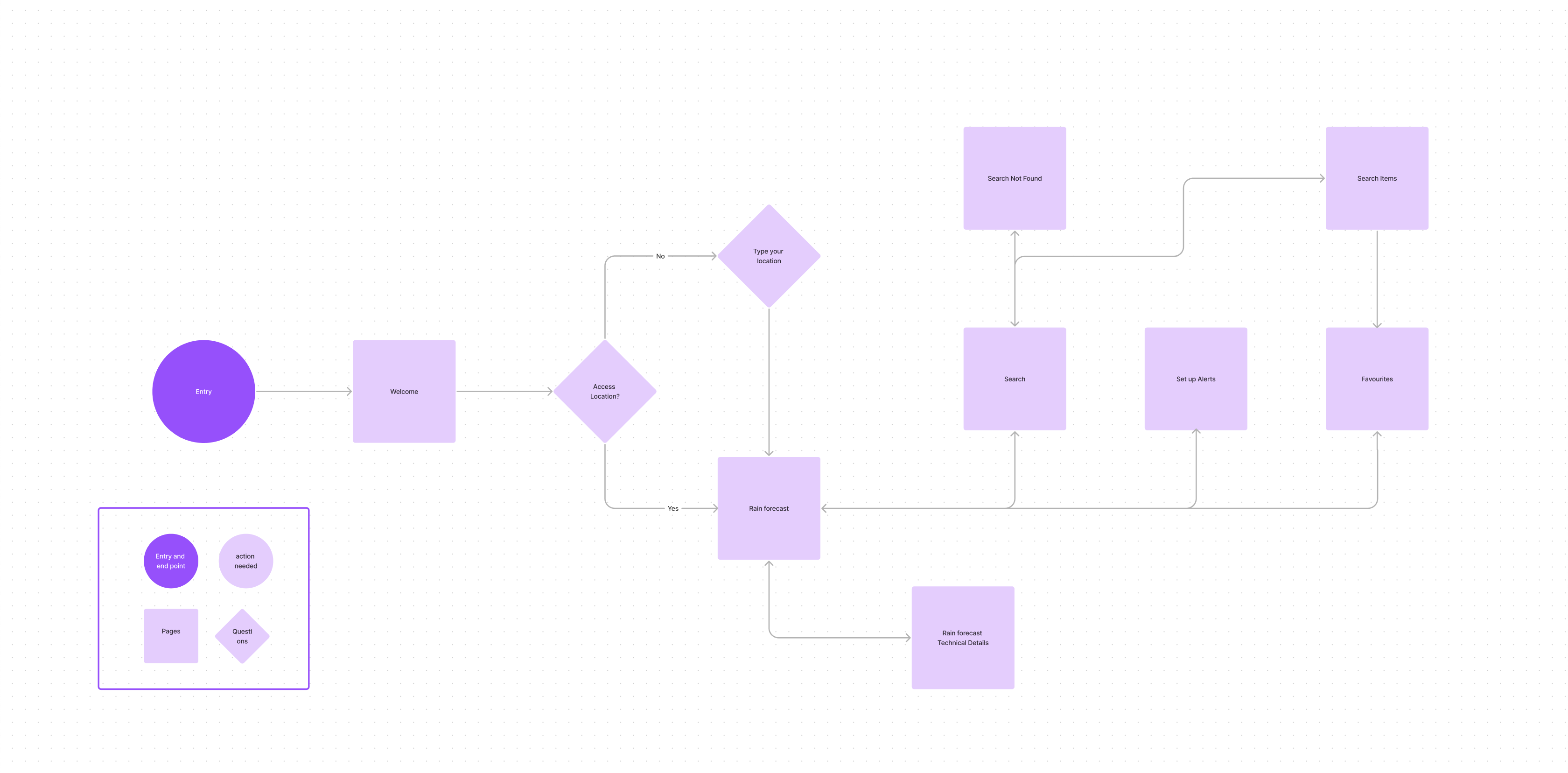
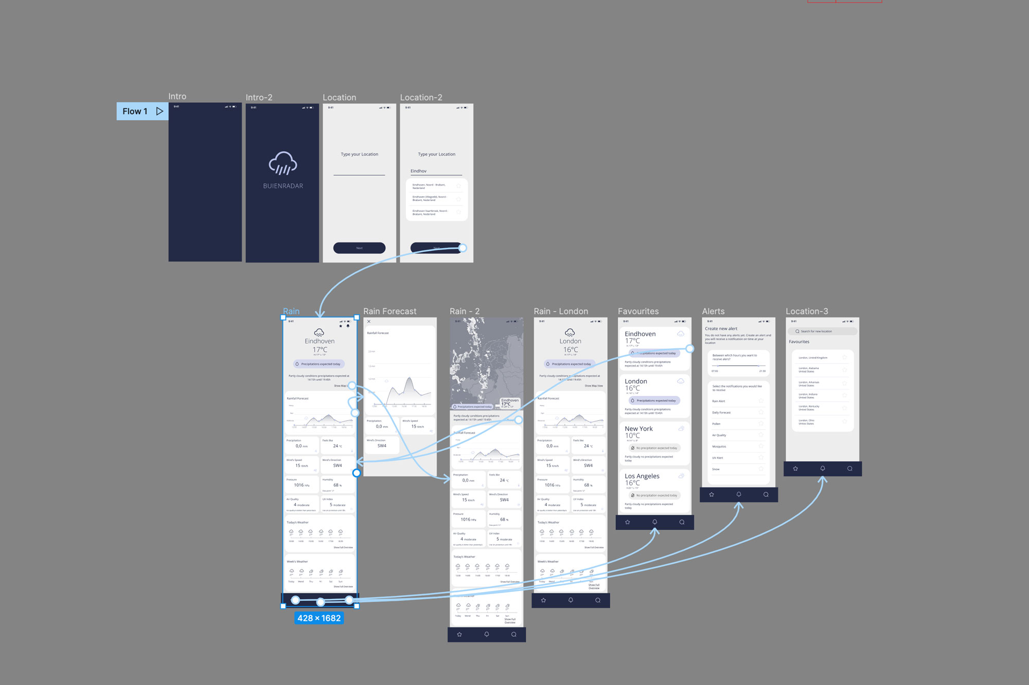
User Flow
Taking into account the timeline as the main component, I designed the following User Flow
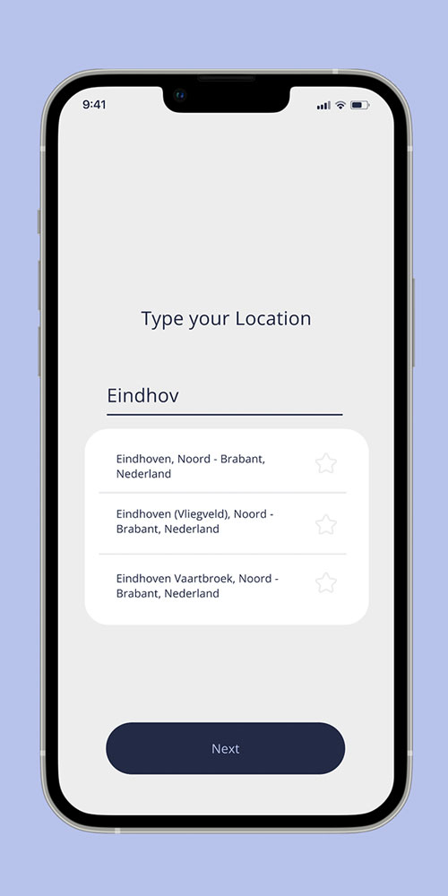
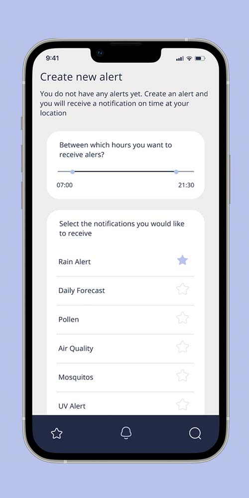
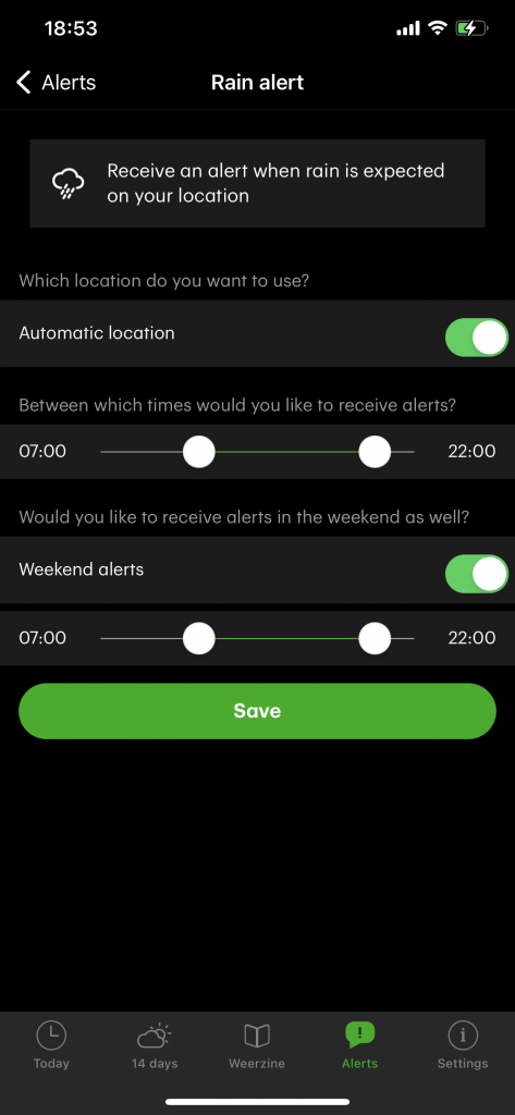
Prototype
The Ux prototype I designed takes the timeline as his main component but with just one click we could access a map incase we need or want to.
The structure of the layered data in the map is now also in the main screen, the user won’t need to go through all the layers to find the information they are looking for in just one page.
What we Learned
The future and next iterations and what we learned.
Since this is a concept I decided to stop with the first iteration. But the research gave me a few insights of how the future of this app would be if the design team continued its process to offer a better user experience.
Machine Learning and Personalised Alarms.
Many of its users may benefit from machine learning to get personalised alarms based on your routines, warnings based on your routes, etc
Climate change is affecting us already with extreme changes in weather and less “stable” seasons. Iterating more into this product may gives us more insights on how to help users to deal with this changes and achieving a more active and healthy life
UI Concept