365 Scores
Overview
365 Scores is an application to follow the live results of almost any sport, if you are into any sport, 365 offers you all the information you would desire to know about the team or sport you follow.
As a sports fan I do follow some sports and overtime I’ve used different apps to track my favorite team. It’s interesting how different some of these apps are and at the same time some offer great experiences in certain areas but still there is not one that has the upper hand in all their aspects.
I am using one of the best apps, 365 Scores, as an example of things that can improve based on its competitors.
Project Name: 365 Scores
Website: 365 Scores
Project Categories: UX, UI
Developed in: Figma
Case Study
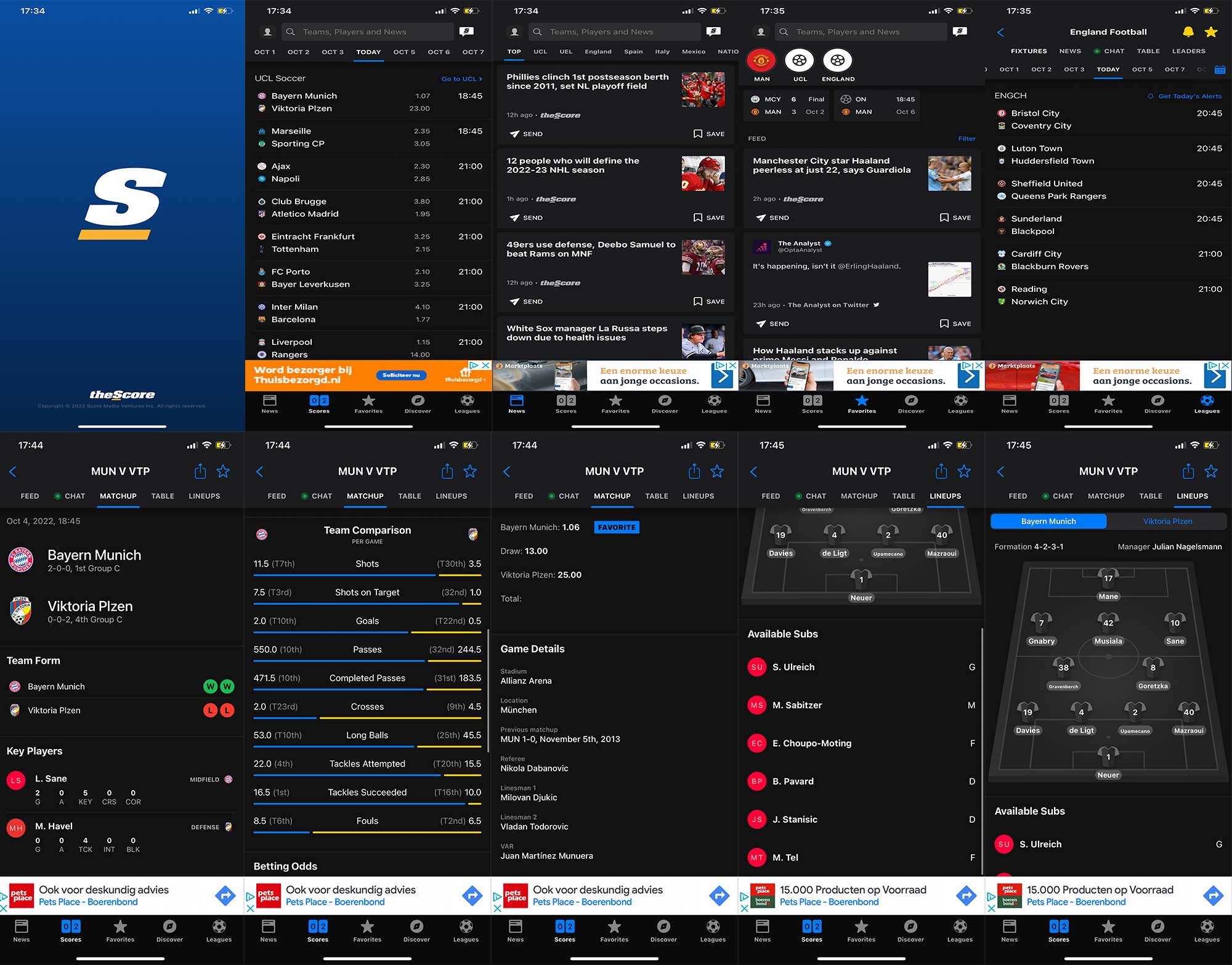
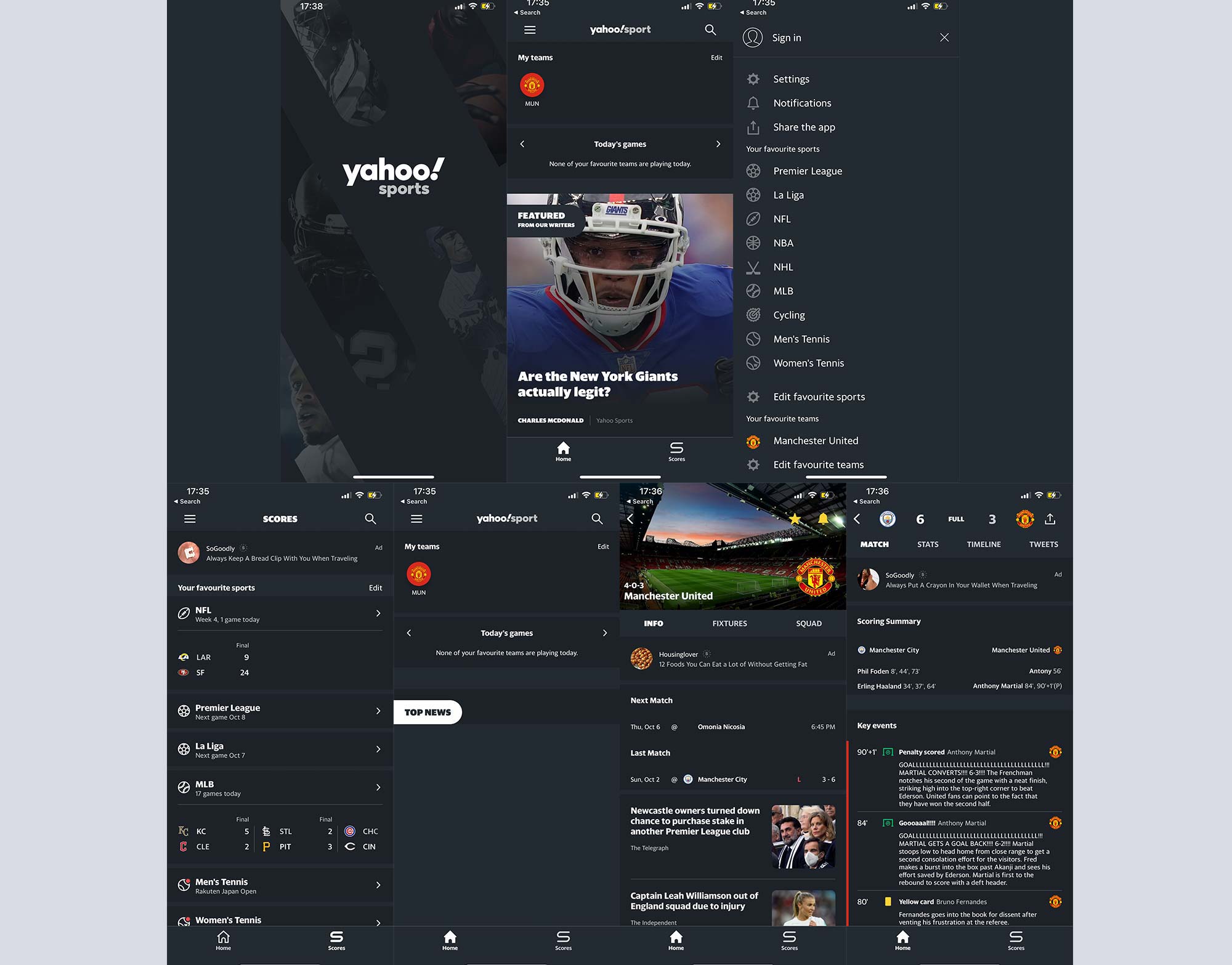
The competitors I chose were 2 of the best ranked apps, Yahoo! Sports and theScore.
It didn’t take long to realise the UI needs to be updated and after spending some time doing research it became crystal clear 365scores UI is lagging behind its competitors
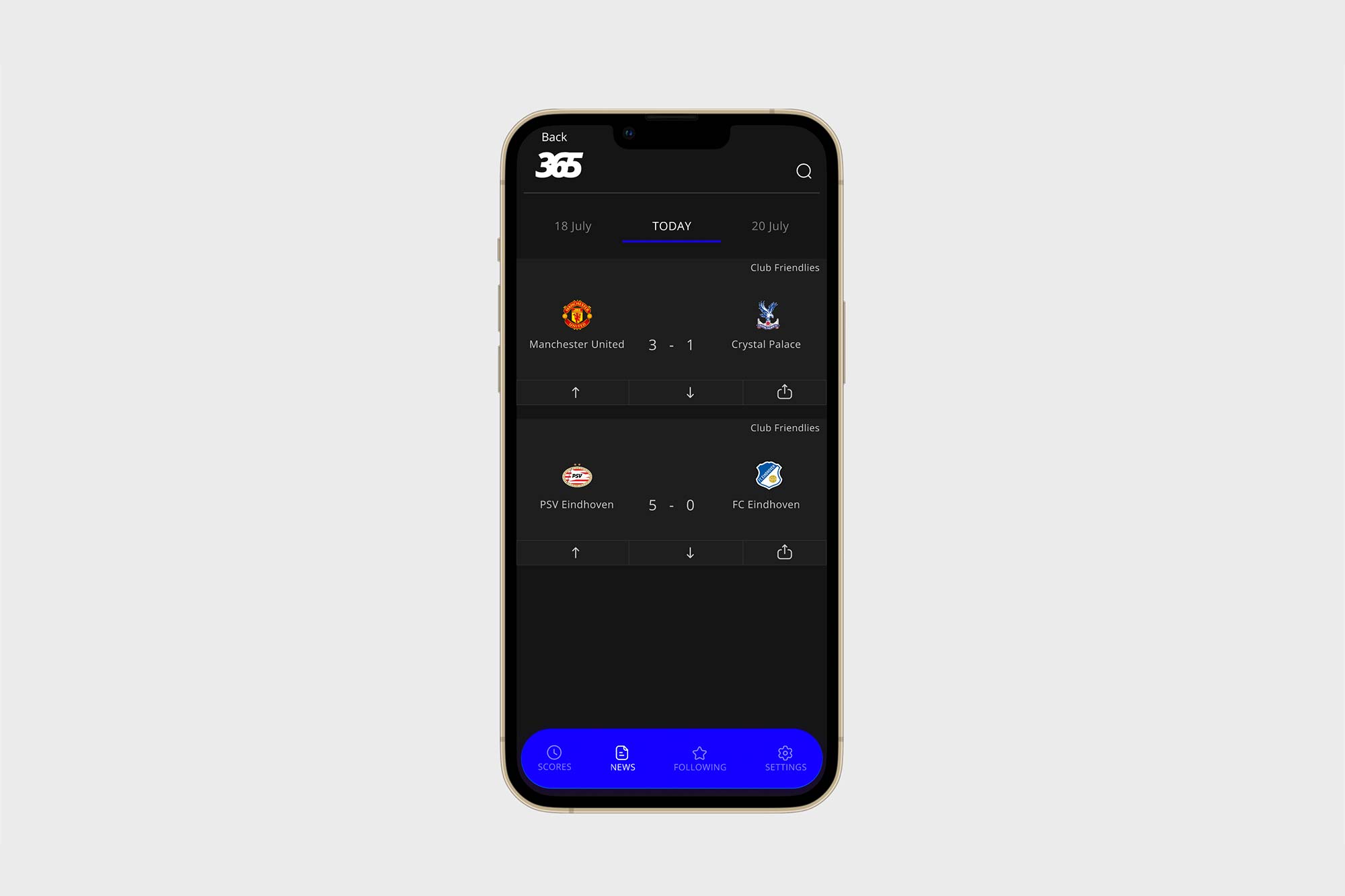
The first concept that pops up in my mind that I think needs to be updated is the chronological swapping to see the past and future events. While this feature feels appropriate for instagram, this feature it’s confusing when you try to differentiate past, present and future events in a long list since it is easy to scroll far too much.
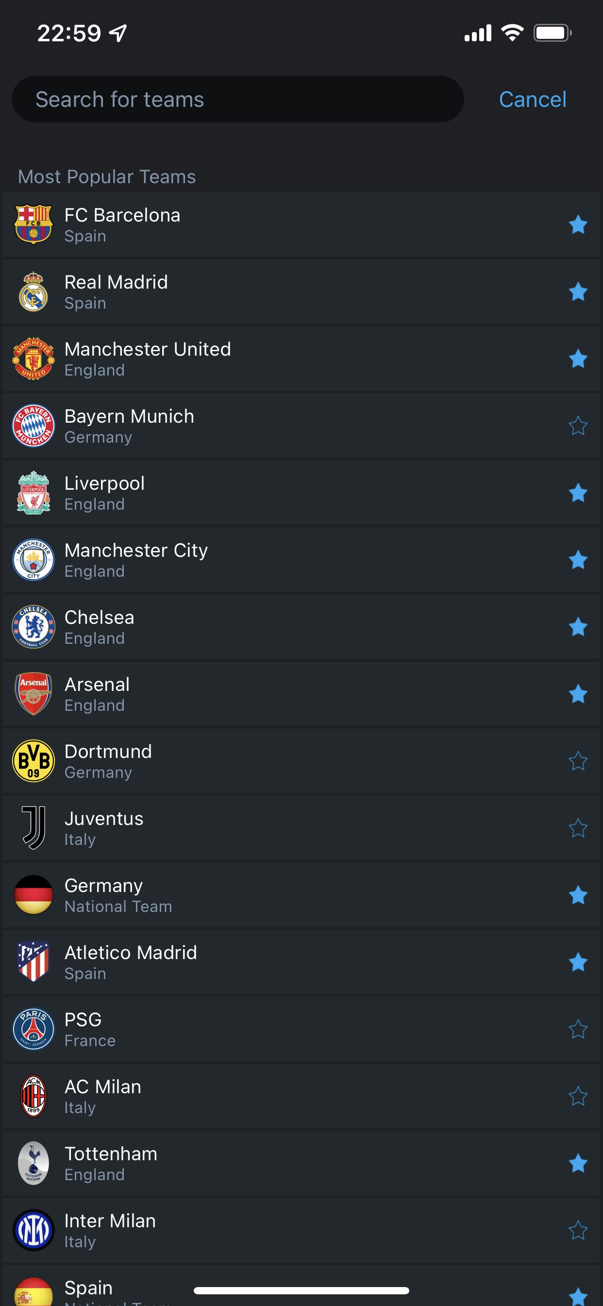
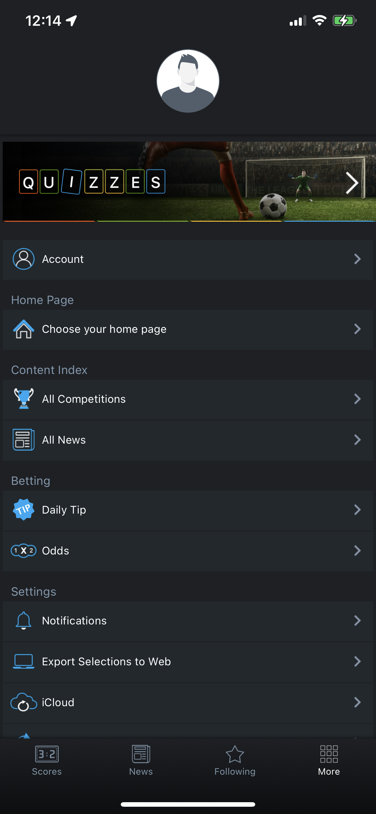
The settings screen is also confusing, it contains too much information in it, the range of information you can find there it’s also too broad, complicating the user when he is in need to find what he is looking for. The alternative could be nesting some or all these options or dividing them in two separate menus.
In the UI you can find the traits of the first skeuomorphism era, very popular back in the early smartphone adoption which as a user makes you feel the application may be outdated and probably not upgraded as much as it may need.
Users will benefit from an easier and refreshed UX and UI experience from this app but 365 Scores would also benefit from it since a better UI and UX would make them able to get one step ahead from its competitors but in this process I found why it may offered the best all rounded experience from this 3 apps, compare to both of them it offers the best personalised experience, getting rid of almost any distraction when you have already set up your preferences.
Research
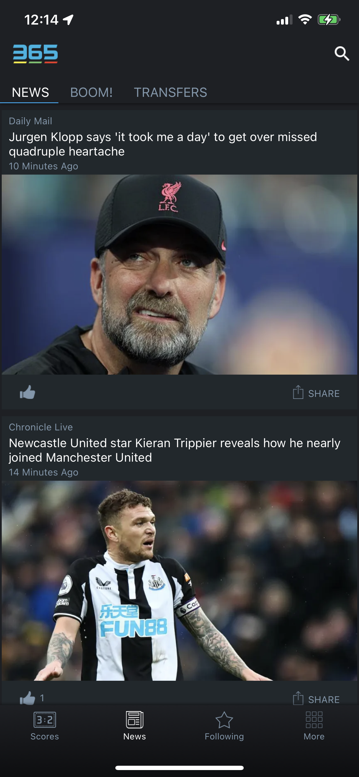
TheScore
This is the differences I found between 365 and theScore
Pros
- Better UI
- In game Chat for its users
- TheScore is focus on mostly all sports
- You can chat or share news with your friends through a built in messenger
Cons
- You have not a personalised homepage
- It takes so many clicks to find the news of a specific team
- The Scores page is also not personalised, you may have too much undesired information
Yahoo! Sport
In the case of Yahoo! Sport the pros and cons I found are this.
Pros
- Much minimal design
- Less clicks to find your teams compare to TheScore
- The same as TheScores it is focus on all sports
Cons
- You have not a personalise homepage
- Many of the personalised information is hidden under a menu icon
- The Scores page is also not personalise, you may have too much undesired information
365 Scores
This is the differences I found between 365 and theScore .
Pros
- Personalised homepage
- Personalised news
- It is easy to find the information you want
Cons
- Has the worst UI
- The UX is better than some of his competitors but still has room for improvement
- In-game Chat
- Simplify the profile menu, it has far too much information.
The research gives us clear ideas of what 365 Scores focus may need to be for their next iterations. And also its strongest points
- Personalised homepage ✅
- Personalised News ✅
- Good UI ❌
- Good UX ❌
- Good profile menu ❌
- In – Game Chat ❌
A In – Game Chat would mean a change in the infrastructure and protocols on how to process information and although it could be a nice feature to add, it is something that could be addressed in future iterations.
User Test
After creating a MVP with the new features and the proposed UI, I conducted a test which gives us positive results which can be seen in the next chart.
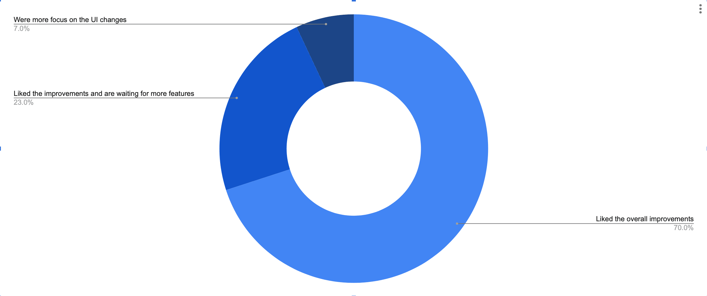
Conclusion
After spending time in 365Scores and its competitors’ apps, I believe there is plenty of room to continue doing more iterations and user testing to find opportunities of improvement to create a better experience for the sports fans.
Original Design

Research
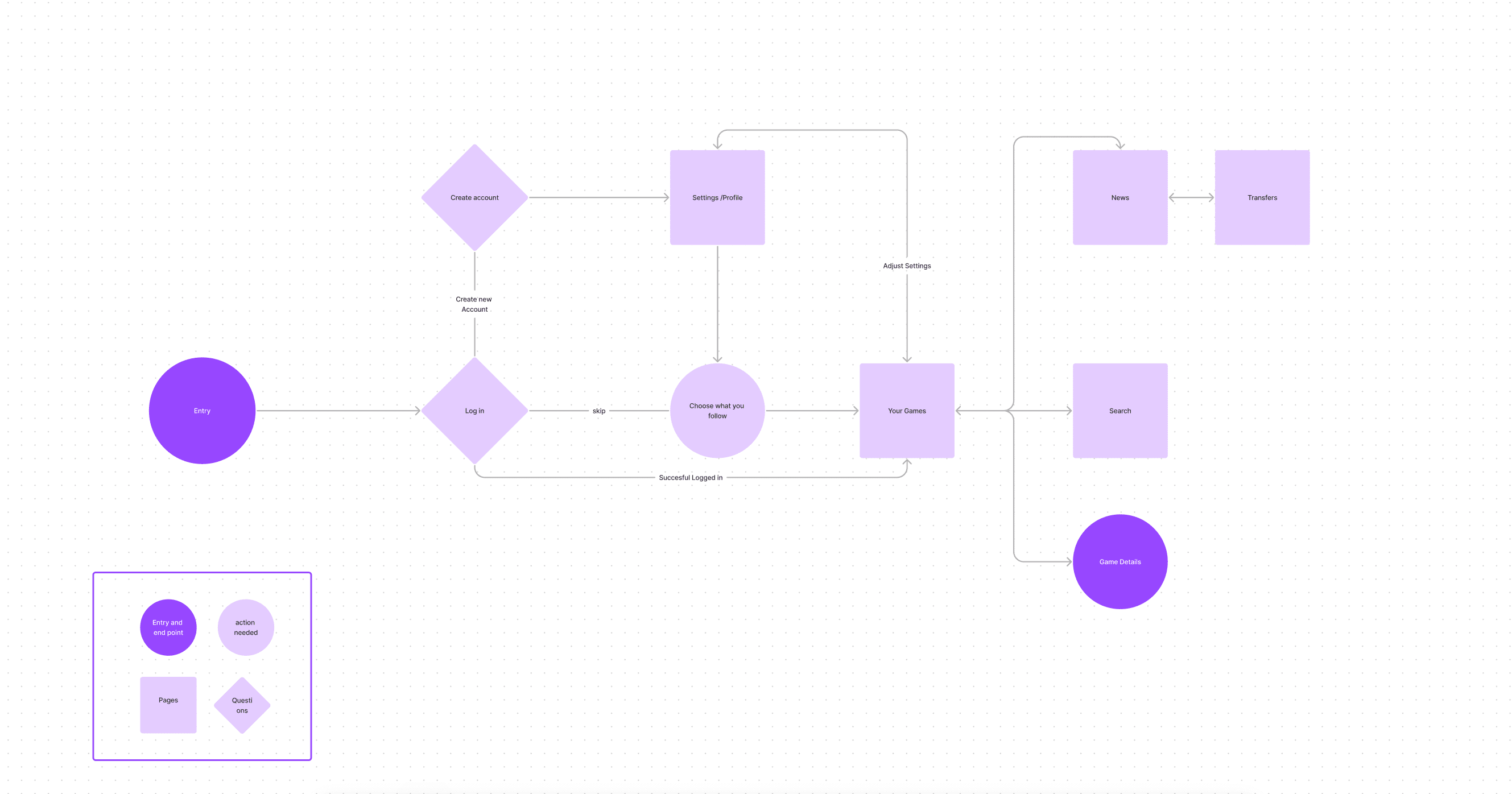
Wireframe and Prototype

UI Concept based on wireframes